
WHEN THE ROOM NEEDS TO DECIDE
A decision meeting needs more than a recommendation.
You may already know what you're asking for. But if the room can't see the issue, the tradeoffs, the risks, and the path forward clearly, the decision can stall, splinter, or drift into everything except the decision.
A decision visual anchor gives leaders a shared surface for seeing what matters, weighing the options, and moving towards a clear yes, no, not yet, or next step.
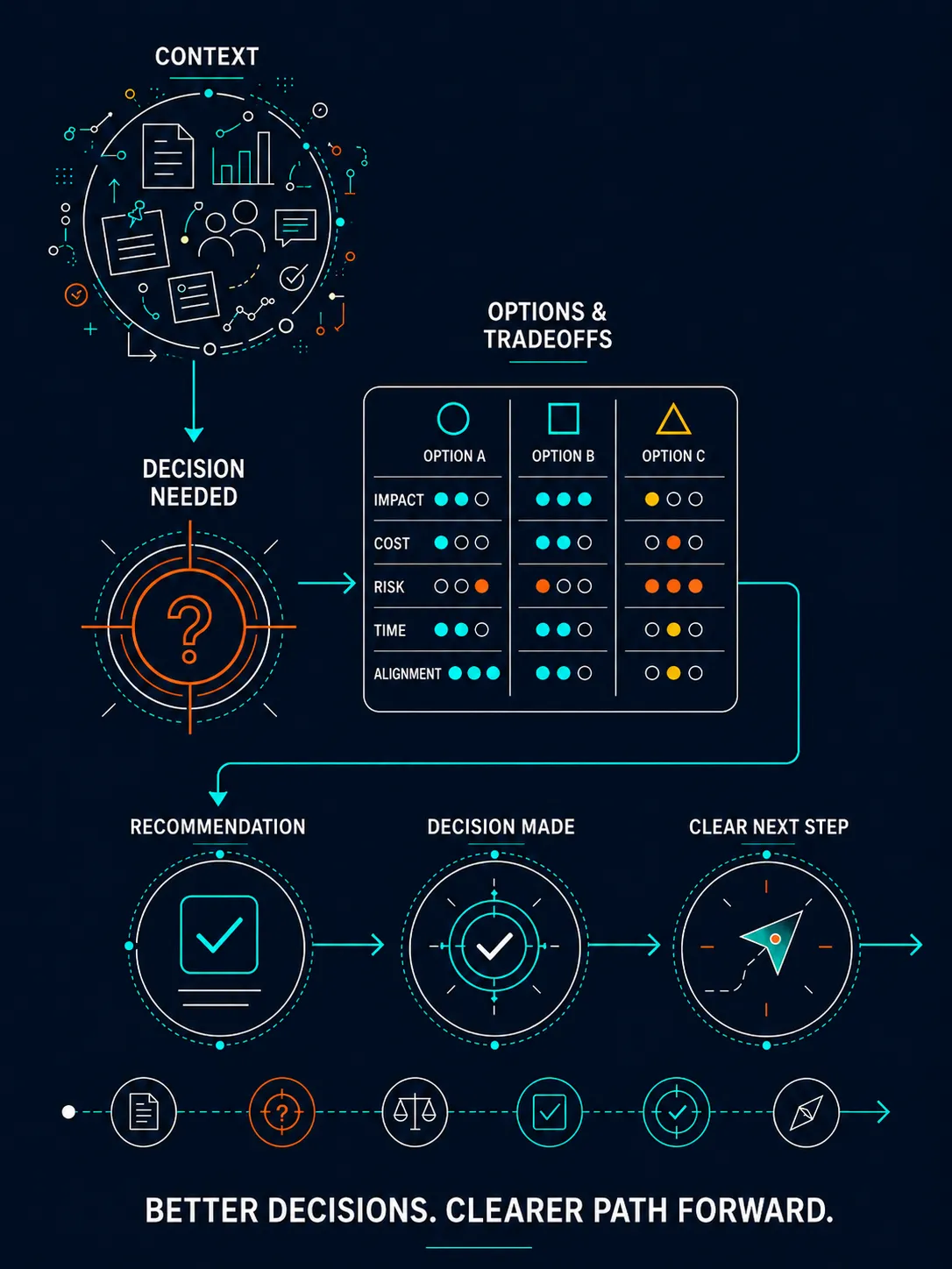
The decision may be clear to you.
That doesn't mean it's clear to the room.
You’ve done the thinking.
You’ve gathered the facts.
You’ve weighed the options.
You’ve lived with the constraints.
You’ve probably had three hallway conversations, two side meetings, and at least one moment where you thought, “Why are we still talking about this?”
Now you need the room to make a decision.
Not admire the work.
Not debate every detail.
Not reopen the entire problem.
Not wander into implementation before the core choice is made.
You need people to see the situation clearly enough to choose.
That is where a decision visual anchor helps.
It gives the room a structured way to understand what is being decided, why it matters now, what options are on the table, what tradeoffs come with each option, and what happens next.
Because when the stakes are real, a decision meeting can’t depend on a dense memo, a scattered slide deck, or your ability to verbally hold the whole room together.
The decision needs architecture.
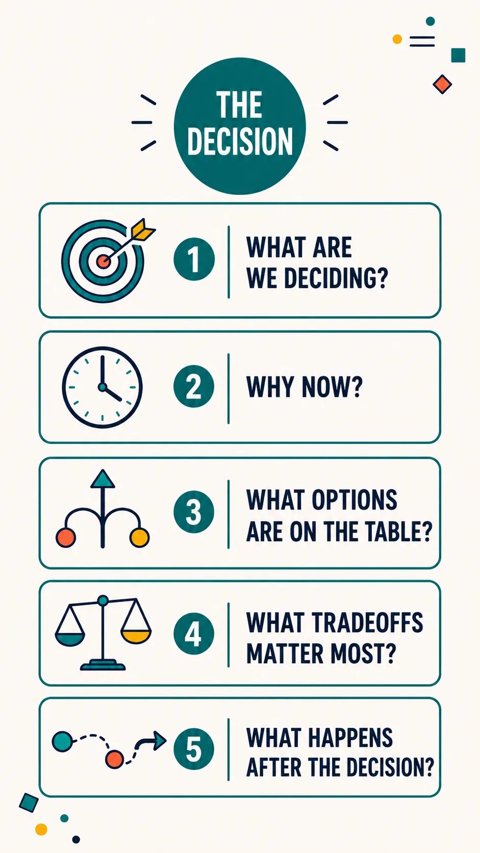
I LEARNED THIS THE HARD WAY
I used to think a strong recommendation was enough.
For a long time, I believed decision meetings were won or lost on the strength of the recommendation.
So I prepared the recommendation.
I had the background.
I had the analysis.
I had the pros and cons.
I knew the decision I wanted.
I knew why it mattered.
And still, the room could get messy fast.
Someone would challenge a small assumption.
Someone else would ask about cost before we had agreed on the need.
Another person would jump straight into staffing, politics, timing, or edge cases.
Someone would want to revisit an old decision everyone thought was settled.
And because I knew the material, I could answer all of it.
That was part of the problem.
I’d start explaining. Then over-explaining. Then responding to every thread in the room until the decision itself disappeared underneath the conversation.
The meeting might end with polite nods, but not real commitment.
Then came the cleanup.
Follow-up emails.
One-on-one clarification.
Rebuilding support.
Restating the recommendation.
Trying to recover the momentum the meeting should have created.
Eventually I realized the issue.
I had prepared the case.
I had not prepared the decision.
And I had not prepared the room to make it.
THE SHIFT
The visual anchor changed the decision conversation.
Once I started building decision visual anchors before high-stakes meetings, the conversation changed.
Not because the room suddenly became easy.
It didn’t.
People still had opinions.
They still had concerns.
They still saw risk from different angles.
They still brought their own priorities into the room.
But the visual gave us a place to return.
When the conversation drifted, the anchor brought us back to the decision.
When someone raised a concern, we could place it against the tradeoffs.
When someone wanted to debate details too early, we could separate the decision from the implementation plan.
When leaders had different assumptions, the visual made those assumptions easier to name.
The visual did not force agreement.
It made the decision discussable.
Decision-making is rarely blocked by a lack of information. It is usually blocked by unclear framing, hidden tradeoffs, competing definitions of success, or fear of what the decision will set in motion.
A strong decision visual anchor helps surface those things cleanly.
The question is not,
"How do I explain everything?"
The better question is:
"What does this room need to see
to make an informed decision?"
WHAT A VISUAL ANCHOR CAN MAKE EASIER
A strong visual anchor helps the room stay with the decision long enough to make it.
Decision meetings are vulnerable to drift because the room is usually carrying more than the agenda says.
There may be risk. Pressure. History. Politics. Budget concerns. Competing priorities. Different levels of context. Different levels of trust.
A decision visual anchor helps the room slow down enough to see the decision clearly.
It can help leaders:
See the decision in plain language
Understand why the decision is needed now
Separate the core choice from the surrounding noise
Compare options without drowning in detail
Name the tradeoffs instead of talking around them
Understand what is being recommended and why
See what happens after approval
Recognize whether the real need is a decision, discussion, alignment, or escalation
Leave with a clearer shared understanding of what was decided
This is not about making the recommendation prettier.
It is about making the decision easier to hold.
WHAT THIS CAN BECOME
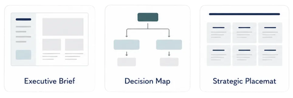
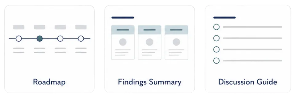
The format depends on the decision the room needs to make.
Once we understand your audience, the decision in front of them, the source material, and the outcome you need, we shape the visual around the conversation.
You do not need to force the decision into a generic template.
We build the visual around what the room needs to see, weigh, discuss, and decide.
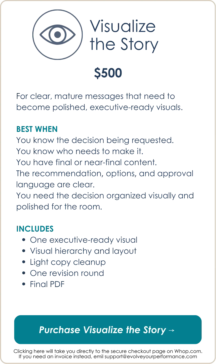
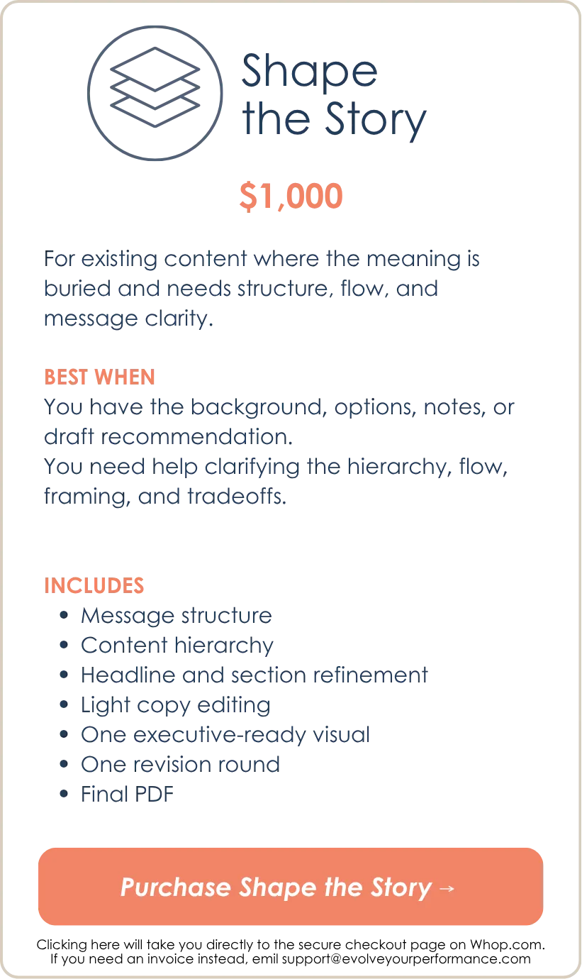
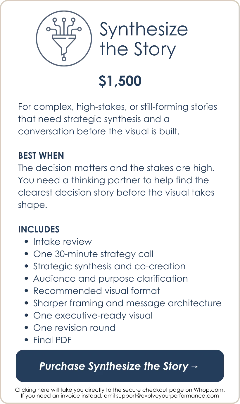
CHOOSE YOUR LEVEL OF SUPPORT
Choose based on how clear the decision story is right now.
The package you choose is based on how much thinking support you need before the visual gets built.
For decision-making visuals, the key question is simple:
Is the decision already clear, or do you need help shaping the logic before you bring it into the room?
WHAT HAPPENS NEXT
The process is simple.
NOTE: Work begins after payment and completed intake are received.

A few questions before you choose
What if I know the recommendation, but I’m not sure how to frame it?
That is common.
A strong recommendation still needs a clear decision frame. The room needs to understand what choice is actually in front of them, why it matters now, what options or tradeoffs matter, and what happens after the decision.
If the content exists but needs clearer structure, choose Shape the Story. If the stakes are high or the story is still hard to frame, choose Synthesize the Story.
What if the decision is politically sensitive?
That is exactly when the visual anchor matters.
Sensitive decisions need careful framing, plain language, and enough structure to keep the conversation from becoming personal, reactive, or scattered. The visual can help separate the decision from the noise around it.
If the language is sensitive, the intake form will ask what must stay exactly as written and what can be clarified.
What if I need approval from a board or executive team?
This is a strong fit.
Boards and executive teams usually do not need every detail you know. They need the right view of the decision: context, recommendation, options, implications, risks, and next steps.
A decision visual anchor helps them see the whole picture without wading through every supporting document in real time.
What if there are several options on the table?
Then the visual may need to compare the options cleanly.
That might look like an options matrix, a tradeoff map, a decision tree, a strategic choice map, or a recommendation placemat. The right format depends on what the room needs to evaluate.
What if the room keeps getting stuck in implementation details?
That is a sign the decision frame needs to be clearer.
A good visual can separate the decision from the implementation conversation. It can show what must be decided now, what comes later, and what questions belong in the next phase.
That keeps the room from trying to solve the whole future before choosing the path.
What if we are not ready for a final decision yet?
Then the visual can support a decision-shaping conversation.
Sometimes the real purpose is not approval yet. It may be narrowing options, confirming criteria, surfacing risks, or aligning on what information is still needed.
That is still decision support. The visual simply needs to be built for the right stage.
What if I have too much information?
That is normal.
The goal is not to squeeze every detail into one page. The goal is to create the right view for the decision conversation.
Some details may belong in the visual. Others may belong in backup materials, an appendix, a board packet, or the full report.
What if I choose the wrong package?
The package is based on how much thinking support you need before the visual gets built.
If your request appears to be significantly outside the package you selected, we will flag that before the build begins and recommend the right adjustment.
The goal is to make sure the work is scoped correctly so the final visual is useful.
Is this just graphic design?
No.
Graphic design can make information look better.
This work helps make the decision clearer.
The design matters, but the value is in the sensemaking: the framing, hierarchy, tradeoff logic, message structure, and visual architecture that help the room understand what is being asked and why it matters.

Ready to give the room a clearer way to decide?
You do not need another meeting where the recommendation gets buried under side questions, old history, implementation details, or competing assumptions.
If the decision matters, the room needs a visual anchor strong enough to hold the conversation.
Choose the level of support that fits where your decision story is now, and we will help turn the complexity into an executive-ready visual the room can actually use.
Still thinking it through? Check out the How it Works page to learn more and download the free guide.
We make complexity visible.
We help people see the patterns.
We turn understanding into action.
That's executive storytelling.
An Evolve Your Performance offering.
© 2026 Evolve Your Performance, LLC
All rights reserved.