WHEN PEOPLE NEED TO MAKE SENSE OF THE CHANGE
Change communication needs more than an announcement.
You may know what is changing, why it matters, and what needs to happen next. But people across the organization will experience the change differently.
Executives need a consistent message.
Middle managers need to make sense of the change while helping their teams do the same.
Frontline employees need to understand what the change means for their daily behavior.
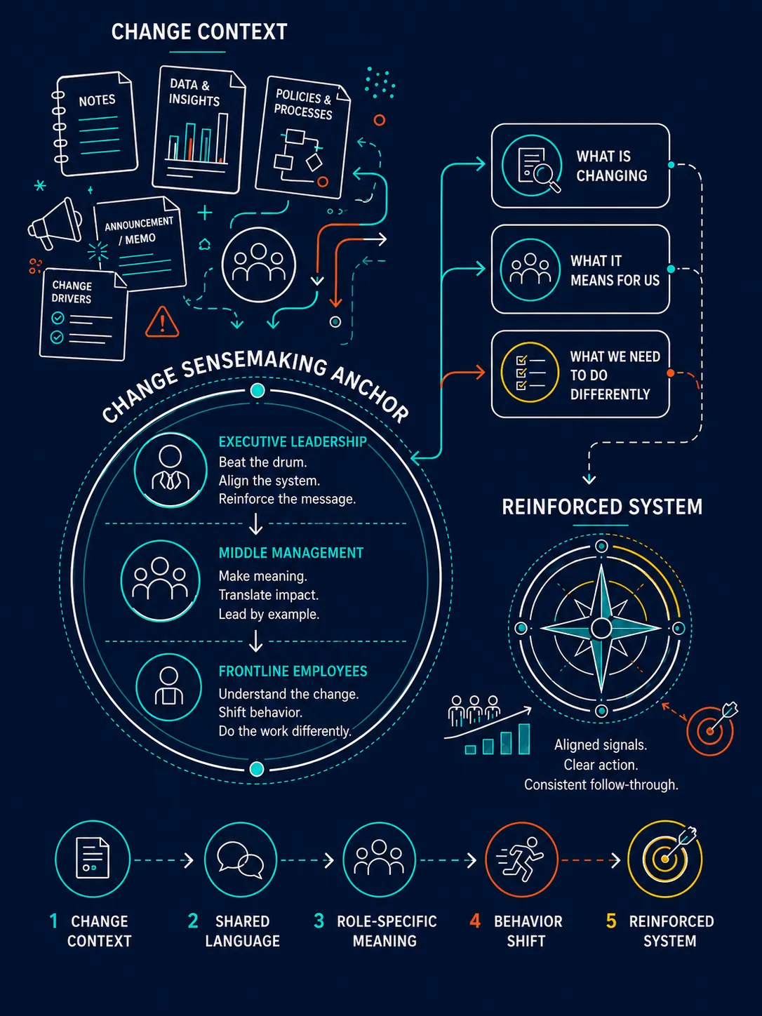
A strong change visual anchor creates shared language, shared meaning, and a clearer path from understanding to action.
People do not adopt a change
just because they hear about it.
You may be preparing for a transformation rollout, operating model change, new strategy, restructuring, process change, technology implementation, culture shift, policy change, service redesign, or major initiative.
You may already have the announcement.
The email.
The deck.
The timeline.
The talking points.
The business case.
The FAQs.
The implementation plan.
And still, the real work has not happened yet.
Because people do not respond to change as one audience.
Executives hear enterprise risk, strategic urgency, and system alignment.
Middle managers hear impact, tension, workload, and accountability.
Frontline employees hear, “What does this mean for me on Tuesday morning?”
If the change message is too broad, people fill in the blanks.
If the language is inconsistent, people create their own version.
If managers are not equipped to explain it, the middle becomes a rumor mill.
If executives say one thing but the systems reward another, people tend to believe the system.
That is where a change visual anchor helps.
It gives the organization a shared language for the change, a clearer picture of what is shifting, and a practical way to understand what different groups need to do next.
Not more noise.
A better meaning-making surface.
I LEARNED THIS THE HARD WAY
I used to think explaining change meant making the message clear.
For a long time, I thought the hard part of change communication was getting the message right.
So I would focus on the content.
The why.
The what.
The timeline.
The benefits.
The risks.
The talking points.
The next steps.
I wanted people to understand the change.
And, the message may have been clear, but clarity at the enterprise level did not always create meaning at the individual level.
Executives might understand the strategy, but talk about it differently depending on the room.
Middle managers might repeat the message, but still be processing their own uncertainty.
Frontline employees might hear the words, but not understand what they were supposed to stop, start, or do differently.
Then, the organization would start leaking energy...
People would ask the same questions over and over.
Managers would improvise answers.
Executives would send slightly different signals.
Old processes would keep rewarding old behavior.
Teams would comply on the surface while holding back underneath.
Nobody was trying to break the change.
They were trying to make sense of it.
And when people do not have a shared way to make sense of change, they make their own meaning.
Eventually, I realized the problem:
I had prepared the communication.
But I had not prepared the sensemaking.
THE SHIFT
The visual anchor changed how people processed the change.
Once I started using visual anchors for change conversations, the work changed.
The change stopped being an abstract message people had to interpret on their own.
It became something they could see.
People could point to the shift.
Name what was changing.
Understand why it mattered.
See what it meant for their part of the organization.
Connect the change to their actual work.
Ask better questions.
Spot mixed signals faster.
Understand what needed to happen next.
The visual did not eliminate resistance.
That is not how change works.
But it made the conversation more honest and more useful.
It gave executives a message to reinforce.
It gave middle managers a translation tool.
It gave frontline employees a clearer connection between the change and their day-to-day behavior.
Change does not move through an organization in a straight line.
It moves through conversations.
And if those conversations do not have shared language, the change fragments.
The question is not,
"Did we communicate the change?"
The better question is:
"Can people make sense of the change and see what they need to do differently?"
WHAT A VISUAL ANCHOR CAN MAKE EASIER
A strong change visual helps people move from awareness to shared meaning.
Change conversations get messy because each layer of the organization is carrying a different job.
The same message does not land the same way at every level.
A strong change visual anchor can help the organization:
Create shared language for the change
Explain why the change matters now
Show what is changing and what is not
Clarify what the change means for different audiences
Equip managers to facilitate sensemaking with their teams
Help employees connect the change to daily behavior
Give executives consistent talking points to reinforce
Surface likely questions, concerns, and resistance points
Reduce mixed messages across leaders, systems, and processes
Create a clearer bridge from understanding to action
This is not about making the change look prettier.
It is about making the change easier to understand, discuss, translate, and implement.
WHAT THIS CAN BECOME
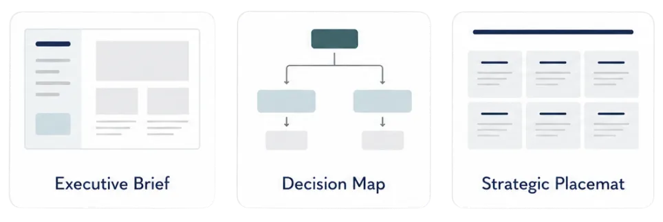
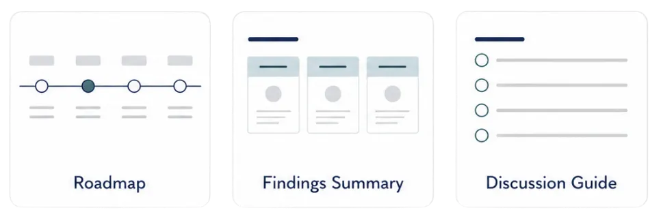
The format follows the job of the visual.
Once we understand your audience, purpose, source material, and desired outcome, we shape the visual structure around the conversation is needs to support.
You do not need to force your story into a template.
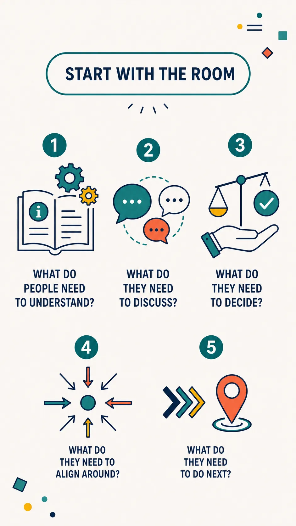
We build the visual around what the room needs to see, understand, and do.
CHOOSE YOUR LEVEL OF SUPPORT
Choose based on how clear the story is right now.
Pick the level of support that matches where you are in the process.
WHAT HAPPENS NEXT
The process is simple.
NOTE: Work begins after payment and completed intake are received.

A few questions before you choose
What if we already have a change communication plan?
That helps.
A change communication plan organizes timing, channels, audiences, and messages.
A change visual anchor helps people make sense of the change. It gives the audience a clearer way to understand what is shifting, why it matters, what it means for them, and what needs to happen next.
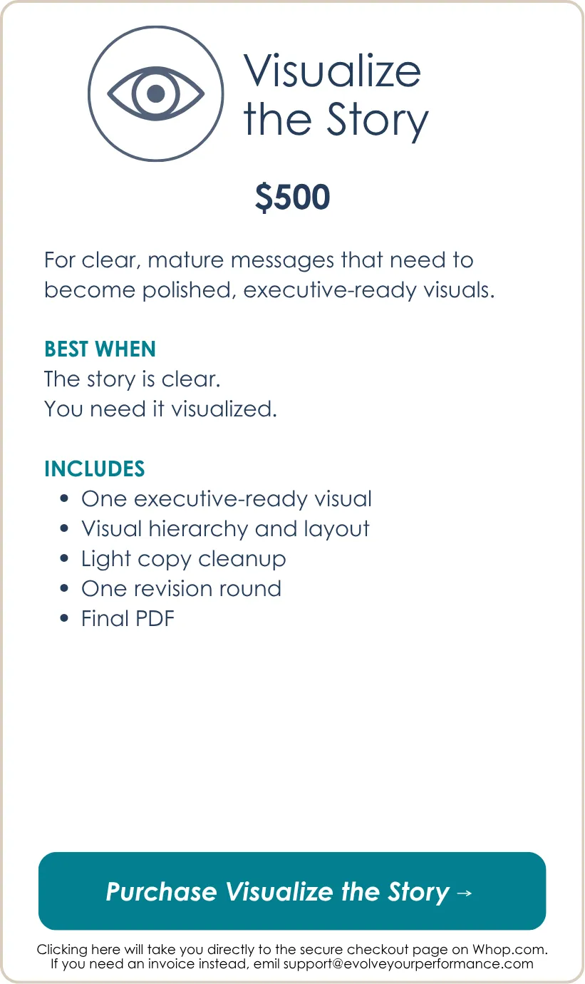
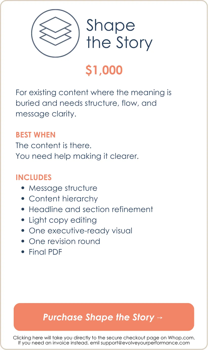
If the plan is already clear and you need it visualized, choose Visualize the Story. If the message needs stronger structure or clearer role-specific meaning, choose Shape the Story.
What if we need different visuals for executives, managers, and frontline employees?
That may be exactly right.
One message can hold the change together, but different levels of the organization often need different views.
Executives may need a reinforcement and system alignment view.
Middle managers may need a team sensemaking guide.
Frontline employees may need a behavior shift visual.
Each package includes one visual. Companion visuals can be scoped separately if you need a connected set.
What if middle managers are the hardest audience?
They often are. They have the hardest job in change.
Middle managers are asked to explain the change while they are still processing it themselves. They also have to answer practical questions, manage emotions, model the change, and translate broad strategy into real work.
A visual anchor can give them a cleaner way to facilitate sensemaking instead of improvising from a dense deck or vague talking points.
What if executives are saying slightly different things about the change?
That is a real risk.
When executives send inconsistent signals, people notice. They may not say it out loud, but they notice.
A change visual anchor can help leadership align on the core message, the language to use, the behaviors to reinforce, and the parts of the system that need to match the change.
What if frontline employees need to change behavior?
Then the visual needs to get practical.
People need to understand what changes in the actual work.
That might mean showing what to stop, start, continue, escalate, measure, or do differently. It may also mean translating the change into scenarios, process shifts, decision rules, or day-in-the-life examples.
What if the change is sensitive?
Sensitive change needs careful framing.
The intake form asks what language must stay exactly as written and what can be clarified. This matters for restructuring, staffing changes, policy shifts, public-facing changes, culture issues, system implementations, or high-trust moments.
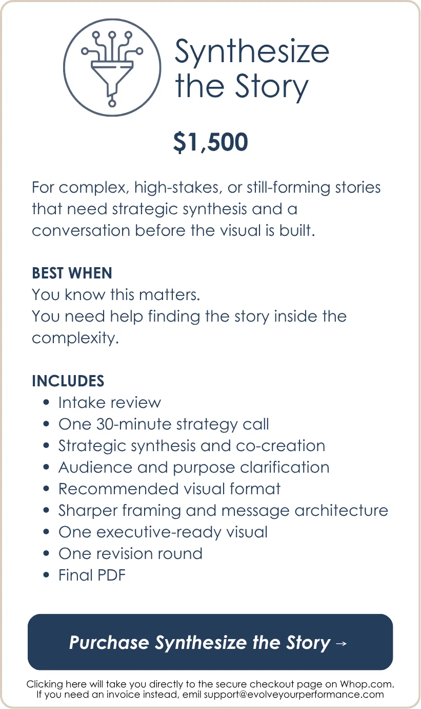
For sensitive or high-stakes change work, Synthesize the Story is usually the better fit because the framing matters as much as the visual.
What if people are resistant?
Resistance is information (and MUCH better than apathy).
A visual will not magically remove resistance, and it should not try to paper over real concerns.
What it can do is make the change clearer, name what matters, give people a shared surface for discussion, and help leaders respond to concerns without losing the thread.
What if the change is still evolving?
Then the visual may need to support sensemaking before final rollout.
Sometimes the right visual is not a polished announcement. It is a discussion anchor that helps leaders or managers test the message, surface concerns, clarify implications, and identify what people need before broader communication.
What if my content is messy?
Messy content is normal.
If the content exists but needs structure, choose Shape the Story.
If the story itself is still hard to frame, choose Synthesize the Story.
If the content is already clear, choose Visualize the Story.
What if I have too much information?
That is common.
The goal is not to fit everything onto one page.
The goal is to create the right view for the conversation.
Some details may belong in the visual. Others may belong in backup materials, an appendix, or the full report.
What if I choose the wrong package?
The package is based on how much thinking support you need before the visual gets built.
If your request appears to be significantly outside the package you selected, we will flag that before the build begins and recommend the right adjustment.
The goal is to make sure the work is scoped correctly so the final visual is useful.
Is this just graphic design?
No.
The final artifact is visual, but the work is not just design.
It is message structure, sensemaking, visual hierarchy, and executive communication.
The goal is not just a better-looking page.
The goal is a clearer conversation.

Ready to help make sense of the change?
You do not need another change announcement that sounds clear at the top and turns into confusion, speculation, or mixed signals by the time it reaches the work.
If the change matters, people need a visual anchor strong enough to create shared language, support sensemaking, clarify role-specific impact, and move the organization toward action.
Choose the level of support that fits where your change story is now, and we will help turn the complexity into an executive-ready visual people can actually use.
Still thinking it through? Check out the How it Works page to learn more and download the free guide.
We make complexity visible.
We help people see the patterns.
We turn understanding into action.
That's executive storytelling.
An Evolve Your Performance offering.
© 2026 Evolve Your Performance, LLC
All rights reserved.