WHEN THE FINDINGS NEED TO LAND WITHOUT OVERWHELMING THE ROOM
The Findings Do Not Speak for Themselves
You may have the data, themes, quotes, patterns, analysis, and recommendations. But if the room cannot see what the findings mean, why they matter, and what needs to happen next, the work can get lost in detail, defensiveness, or polite nodding.
A strong findings visual anchor turns research, assessment, listening, diagnostic, or evaluation work into a clear view that people can understand, discuss, and act on.
The work is not done just because
the findings are accurate.
You may be preparing to share findings from a diagnostic, research project, listening tour, survey, evaluation, assessment, discovery process, engagement effort, needs analysis, interview synthesis, or stakeholder study.
You may already have the material.
The data. The themes. The quotes. The charts. The patterns. The observations.
The recommendations. The full report.
And still, something is missing.
Because findings can be true and still not land.
The room may get overwhelmed by the volume.
Leaders may jump straight to solutions before they understand the pattern.
People may argue with one data point and miss the larger signal.
Stakeholders may feel exposed, blamed, or defensive.
The recommendation may get buried under the evidence.
The “so what” may be clear to you, but not clear to the people who need to act.
That is where a findings visual anchor helps.
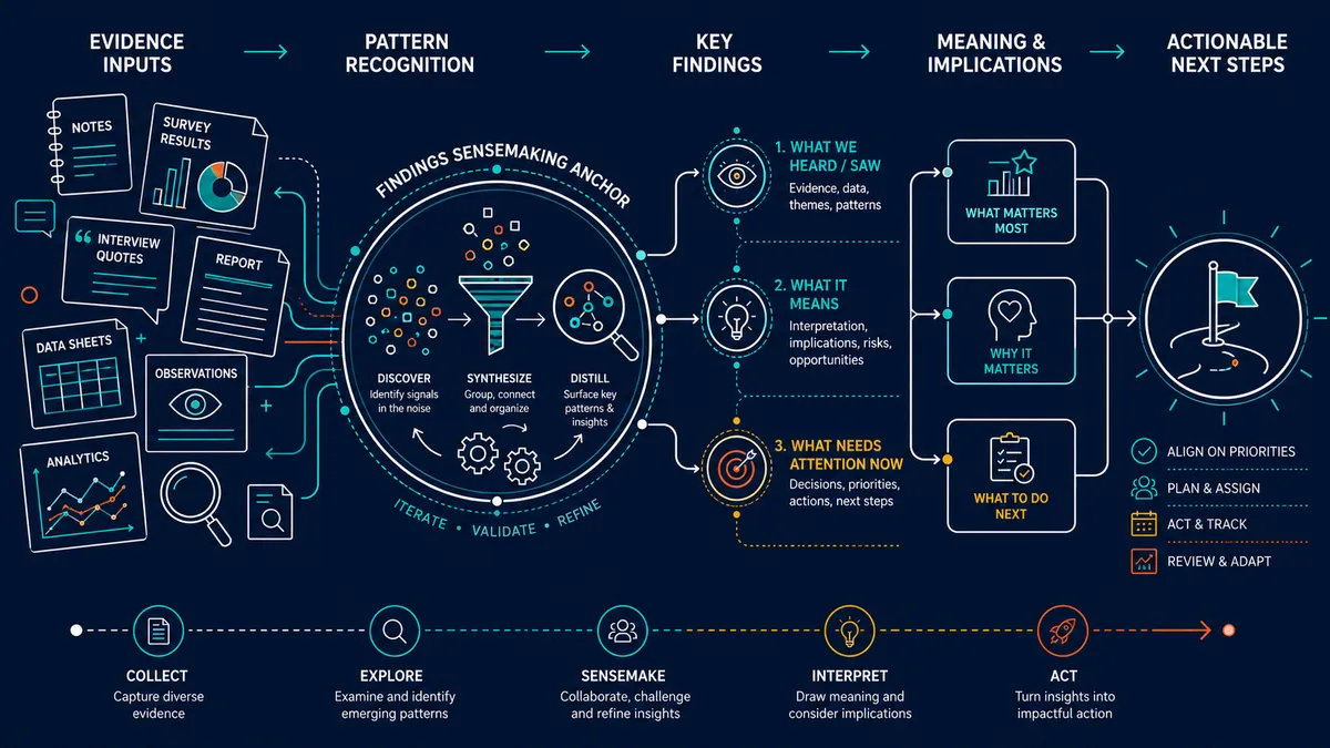
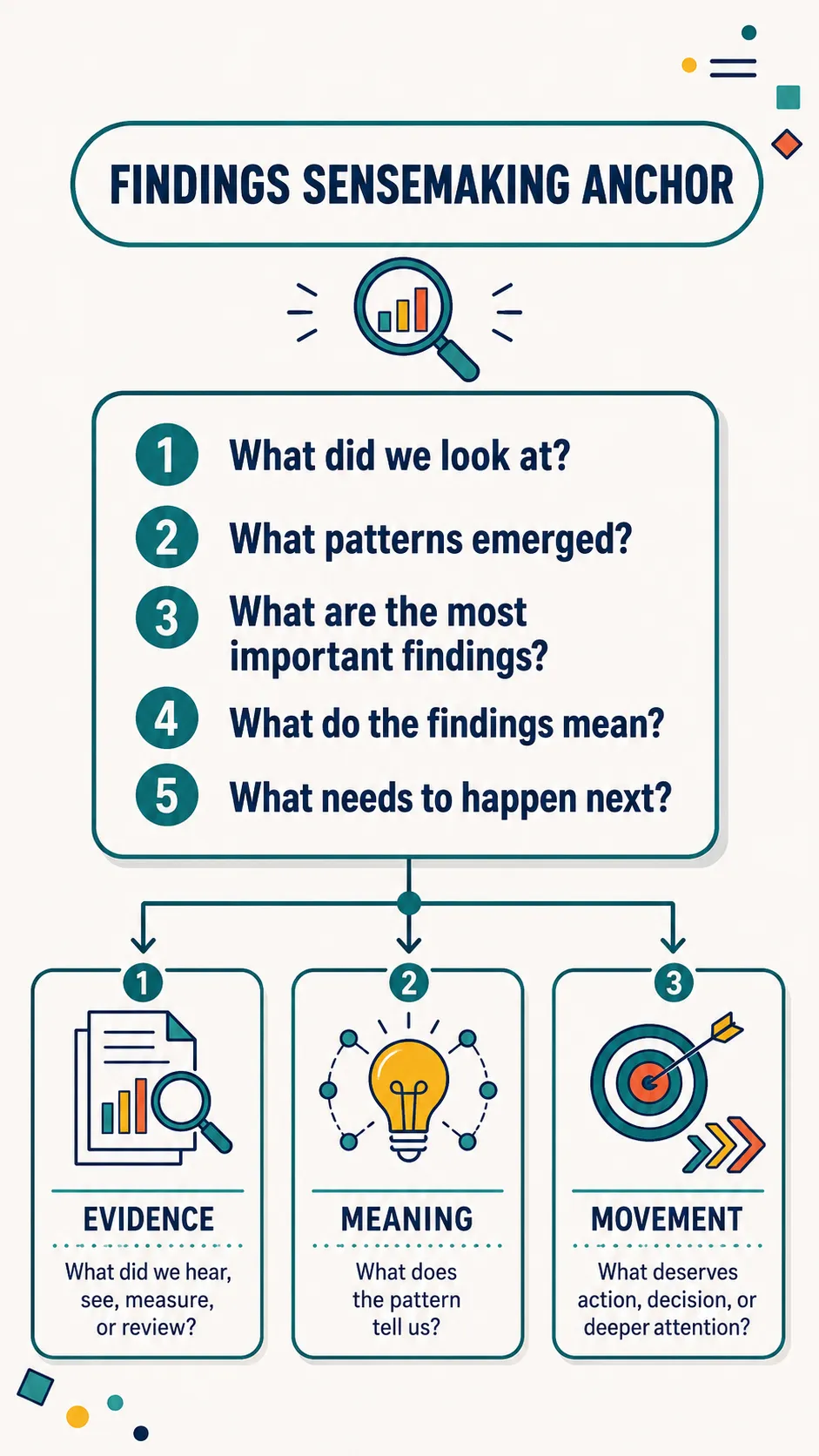
It gives the room a structured way to see what was found, what patterns matter, what the findings mean, and what needs attention next.
Not every detail.
The right view.
Because sharing findings is not the same as transferring information. The goal is to help people make meaning from evidence.
I LEARNED THIS THE HARD WAY
I used to think rigorous research and detailed findings would carry the room.
For a long time, when I had findings to share, I focused on making sure the work was thorough.
The interviews were coded.
The themes were clear.
The quotes were powerful.
The evidence was organized.
The conclusions were grounded.
The recommendations made sense.
I trusted the work.
And I should have.
But I also learned that good findings can still land badly.
A leader would seize on one quote and miss the pattern.
Someone else would challenge the methodology before hearing the meaning.
Another person would want to jump straight to fixing it.
Someone would say, “We already knew this,” while still not acting like they knew it.
The room would start debating the data instead of making sense of the signal.
And because I knew the findings so well, I would start explaining.
More context.
More examples.
More nuance.
More evidence.
The result was usually not clarity.
It was a heavier room.
Eventually, I realized the problem:
I had done the research and prepared the findings.
But I had not prepared the room to receive them.
THE SHIFT
The visual anchor changed how the room engaged with the findings.
Once I started using visual anchors to share findings, the conversation changed.
The findings stopped feeling like a pile of evidence people had to sort through in real time.
They became a shared surface for sensemaking.
People could see the pattern.
Separate signal from noise.
Hold multiple findings at once.
Understand how the findings connected.
See the implications without getting buried in detail.
Ask better questions.
Stay with the meaning long enough to decide what deserved attention.
The visual did not flatten the findings.
It helped the room carry them.
A good findings visual does not reduce the work to a cute summary.
It preserves the integrity of the evidence while making the meaning easier to grasp.
It gives leaders, boards, clients, teams, funders, or stakeholders a way to move from “Here is what we found” to “Here is what it means” to “Here is what we need to do next.”
The question is not,
"How do we show all the findings?"
The better question is:
"What does the room need to see to understand the patterns and act on the meaning?"
WHAT A VISUAL ANCHOR CAN MAKE EASIER
A strong visual anchor helps the room move from evidence to meaning.
Findings conversations get messy because people do not receive evidence neutrally.
Executives hear risk, reputation, cost, and action.
Managers hear workload, accountability, and feasibility.
Teams hear judgment, change, and impact.
Boards hear governance, priorities, and trust.
Funders hear proof, outcomes, and credibility.
Clients hear value, implications, and what comes next.
None of that is wrong.
It is what happens when findings meet real stakes.
A strong findings visual anchor can help the room:
See the most important findings faster
Understand the pattern behind the data
Separate evidence from interpretation
Connect themes, causes, implications, and recommendations
Stay out of the weeds without ignoring nuance
Reduce defensiveness by focusing on the signal, not blame
Compare what was expected with what emerged
Recognize what needs discussion, decision, or action
Leave with clearer shared meaning and next steps
This is not about making the findings prettier.
It is about making the meaning easier to use.
WHAT THIS CAN BECOME
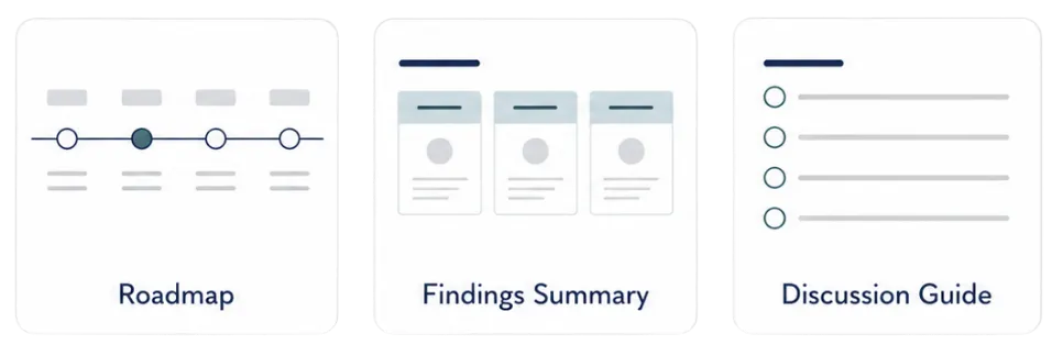
The format follows the job of the visual.
Once we understand your audience, purpose, source material, and desired outcome, we shape the visual structure around the conversation is needs to support.
You do not need to force your story into a template.
We build the visual around what the room needs to see, understand, and do.
CHOOSE YOUR LEVEL OF SUPPORT
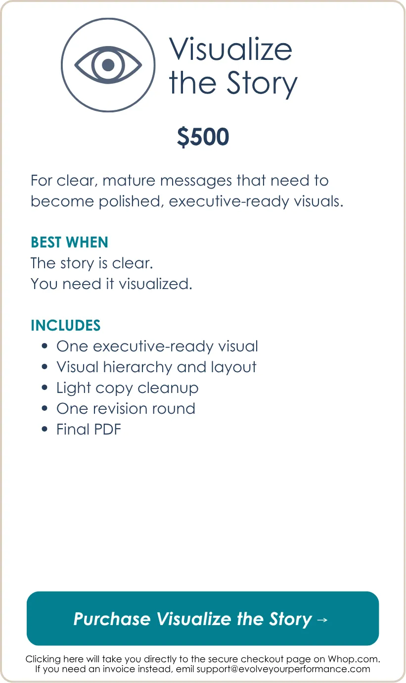
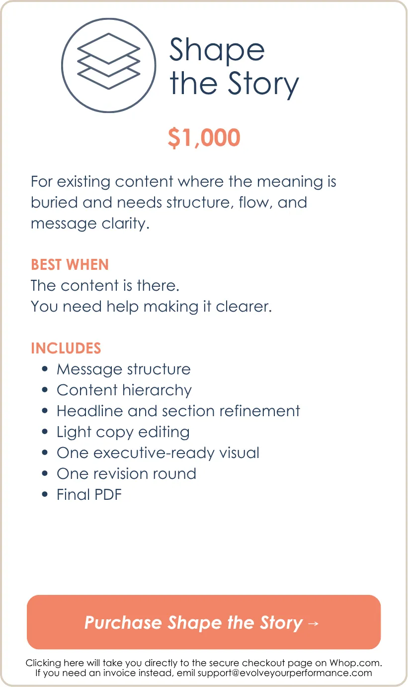
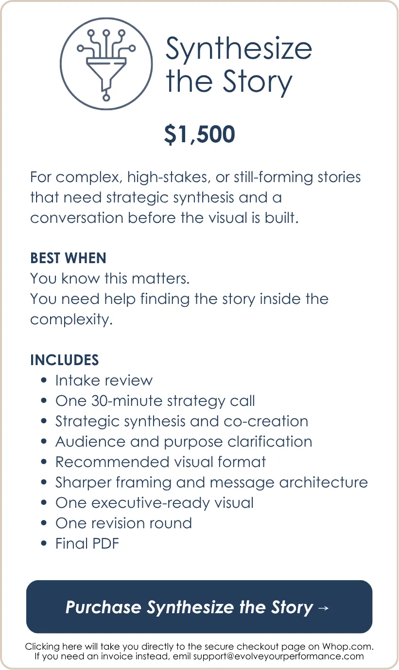
Choose based on how clear the story is right now.
Pick the level of support that matches where you are in the process.
WHAT HAPPENS NEXT
The process is simple.
NOTE: Work begins after payment and completed intake are received.
A few questions before you choose
What if I already have a full findings report?
That helps.
A report documents the work.
A findings visual anchor helps the room understand the meaning of the work.
The visual is not meant to replace the full report. It gives people the right view of the findings so they can discuss the signal, implications, and next steps without getting buried in detail.
What if I have a lot of data?
That is common.
The goal is not to fit every data point into one visual.
The goal is to create the right view for the conversation. Some data may belong in the visual. Other data may belong in backup materials, an appendix, a dashboard, or the full report.
What if the findings are sensitive?
Sensitive findings need careful framing.
This may include culture findings, leadership feedback, employee engagement results, equity findings, organizational diagnostics, performance issues, stakeholder criticism, customer feedback, or evaluation results tied to funding or accountability.
For sensitive findings, Synthesize the Story is usually the better fit because the framing matters as much as the design.
What if the findings could make people defensive?
Then the visual needs to help the room stay with the signal instead of personalizing the evidence.
That does not mean softening the truth.
It means structuring the findings in a way that separates observation, pattern, interpretation, and implication so people can engage the meaning without getting stuck in blame.
What if I need to include quotes or qualitative themes?
That can work well.
Qualitative findings often need synthesis so the audience can see the pattern without drowning in excerpts. The visual may use selected quotes, theme clusters, tension maps, implication statements, or evidence-to-action pathways.
What if I need to share survey results?
A survey findings visual can work well when the audience needs to understand more than the numbers.
The visual can show key results, patterns, gaps, bright spots, risks, and implications. The goal is not a chart dump. The goal is a clearer view of what the results mean.
What if I have recommendations too?
Good.
The recommendations should connect visibly to the findings.
The visual can show the throughline from evidence to pattern to implication to recommendation so the audience can see why the next steps make sense.
What if the audience wants the details?
Some will.
That is what backup materials are for.
The visual gives the room a shared anchor. The full report, appendix, data tables, or supporting deck can hold the deeper detail.
What if the findings are not final yet?
Then the visual may need to support sensemaking before finalization.
Sometimes the purpose is to test emerging themes, validate what was heard, gather reactions, or align on what the findings seem to mean before making formal recommendations.
What if my content is messy?
Messy content is normal.
If the content exists but needs structure, choose Shape the Story.
If the story itself is still hard to frame, choose Synthesize the Story.
If the content is already clear, choose Visualize the Story.
What if I choose the wrong package?
The package is based on how much thinking support you need before the visual gets built.
If your request appears to be significantly outside the package you selected, we will flag that before the build begins and recommend the right adjustment.
The goal is to make sure the work is scoped correctly so the final visual is useful.
Is this just graphic design?
No.
The final artifact is visual, but the work is not just design.
It is message structure, sensemaking, visual hierarchy, and executive communication.
The goal is not just a better-looking page.
The goal is a clearer conversation.

Ready to help the room understand what the findings mean?
You do not need another findings presentation where the evidence is accurate, but the meaning gets buried under charts, quotes, caveats, or defensiveness.
If the findings matter, the room needs a visual anchor strong enough to show the signal, protect the nuance, clarify the implications, and move people toward the right next conversation.
Choose the level of support that fits where your findings story is now, and we will help turn the complexity into an executive-ready visual people can actually use.
Still thinking it through? Check out the How it Works page to learn more and download the free guide.
We make complexity visible.
We help people see the patterns.
We turn understanding into action.
That's executive storytelling.
An Evolve Your Performance offering.
© 2026 Evolve Your Performance, LLC
All rights reserved.